App Design
App Kiddoclass
Project Overview
Case Study of a kid friendly video-chat application for younger students in Pre-K to 3rd Grade.
Tools
Adobe XD
Adobe After Effects
Illustrator
Categories
UX Design
About the Application
Kiddoclass is an educational iPad video-chat application that enhances and simplifies the remote learning experience for younger students in Pre-K to 3rd Grade.
The Problem
Due to COVID-19, my Pre-K student started his educational journey remotely on a touch-sensitive iPad in courses taught through live video conferencing. I observed and experienced firsthand the user-experience issues in the existing video conferencing software, when young students use it, because the current video conferencing software
Task
Create an iPad video-chat application that is more suitable for the target group, which includes interactive games, animation, and augmented reality.
Concept Developtment
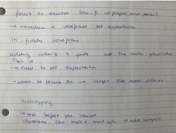
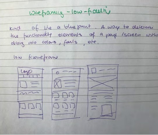
Initial notes
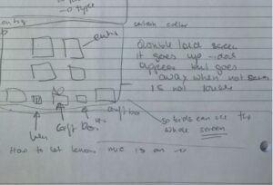
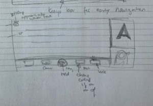
I wrote notes on how to approach my project
Research
I printed out a form, that helps me analyze my target group better. It included who my primary, secondary and tertiary audience are, that will be interacting with the application. I observed my child during online lessons and received feedback from teachers. Teacher explaining to me how online education has been challenging for many students. Especially young students that have never been in a school setting having to sit for long hours. I want to create a layout that is easy to navigate and appealing to the target group. I have researched effective ways on how to encourage preschoolers in distant learning, which I will incorporate in my design:
Emotional check in
this is especially important for young children not always able to verbally explain their emotion. The application would start with asking the student on their well being, there will be characters showing different emotion the student can choose from and this will be sent to the teacher, who will be able to acknowledge their emotion and give them guidance accordingly.
Parents connect
the teacher will be able to send parents information about their student, that the parent can access and see in the app direct. There will be a child lock feature, so the child would not be able to access it.
Similar structure
The pages will be similar structured for the student easy to navigate through.
Non Readers
The majority in the target group won’t be able to read yet, so the design is emphasized on use of images.
Hand-eye coordination
are not often well developed
Buttons
The buttons are to close and small
Fine motor skills
often not well developed yet
Production
Tone of Voice
The app should have a playfull, fun and encouraging voice, and when the student makes a mistake, it encourages them to try again. The tone should be positive, inspiring, encouraging, and nurturing. The application enables the student to build a growth mindset, seeing learning as something fun and welcoming challenges.
Emotional check in
this is especially important for young children not always able to verbally explain their emotion. The application would start with asking the student on their well being, there will be characters showing different emotion the student can choose from and this will be sent to the teacher, who will be able to acknowledge their emotion and give them guidance accordingly.
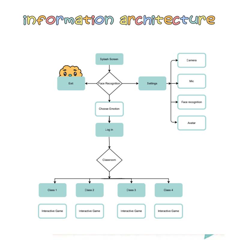
Information Architecture
I designed the architecture with simplicity in mind, while making sure that the well-being of the students is checked daily.
Moodboard & Logo
After doing my research, I create a mood board that represents the fonts and colors that I would like to use for my app. I was looking at colors that help students learn better. I pick shades of red, yellow, green-blue, and as a font, I used Poppino and Kids stuff, Poppino is a font that is easy to read for students. Kids stuff is a font, that is playful. I want to create a fun educational tone of voice that is encouraging. I experimented on designing the logo, I wanted it to look fun, but also reflect that it is an educational app.
Iteration
Many changes from the initial design and structure as seen on the images 1 to 4. Fitt’s law people hit on=screen targets faster the closer they are and the larger they are (Johnson, 2021) I made the buttons bigger and brighter.
Interactive tutorial
Engaging tutorial to help parents and caretaker learn how to navigate the application.
Parents Setting
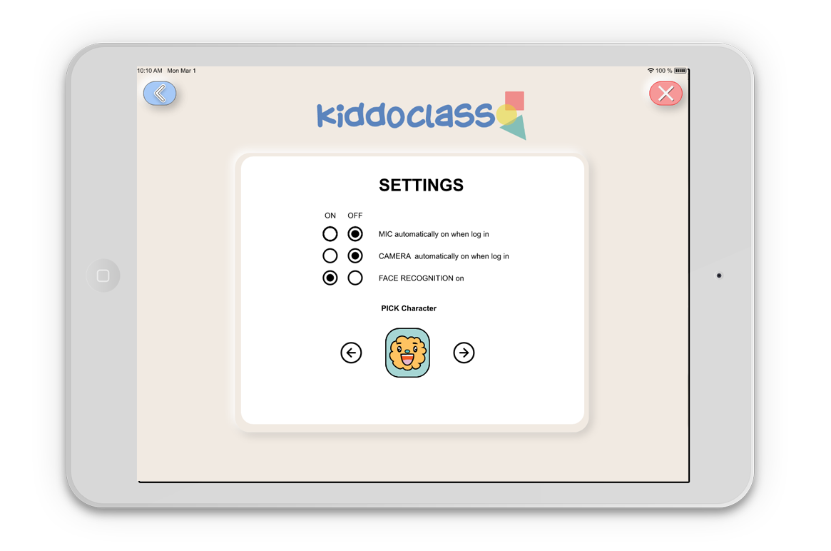
Settings access with protections, so younger students can not change it. Parents can set up face recognition, so students don’t have to type in code to log in. Personalized character, only accessible with parents persmission.
Mindfullness and Curiousness
Daily emotional check-ups and engaging, creative interactive virtual reality games ensuring awakening the child’s curiosity while having their well-being in mind.
Interactive Games with the use of virtual reality
Interactive Application, children draw and watch their creation come to live while playing with their classmates.
Conclusion
This project was a learning process. I had challenges in narrowing down my solution. I have learned so much
with the help of feedback and improved my skills in the area I lacked in. It was a steep learning curve, where I
learned new concepts every week, resulting in changing and adding things to my application constantly. I am happy with the result and, along the way, have found a new appreciation of interfaces that are so well designed that it comes naturally to users to use them. Empathizing with your target group and understanding their needs is essential to creating an effortlessly working interface. Click on the botton to see my high-end prototype.


