Print Design
Impact Report
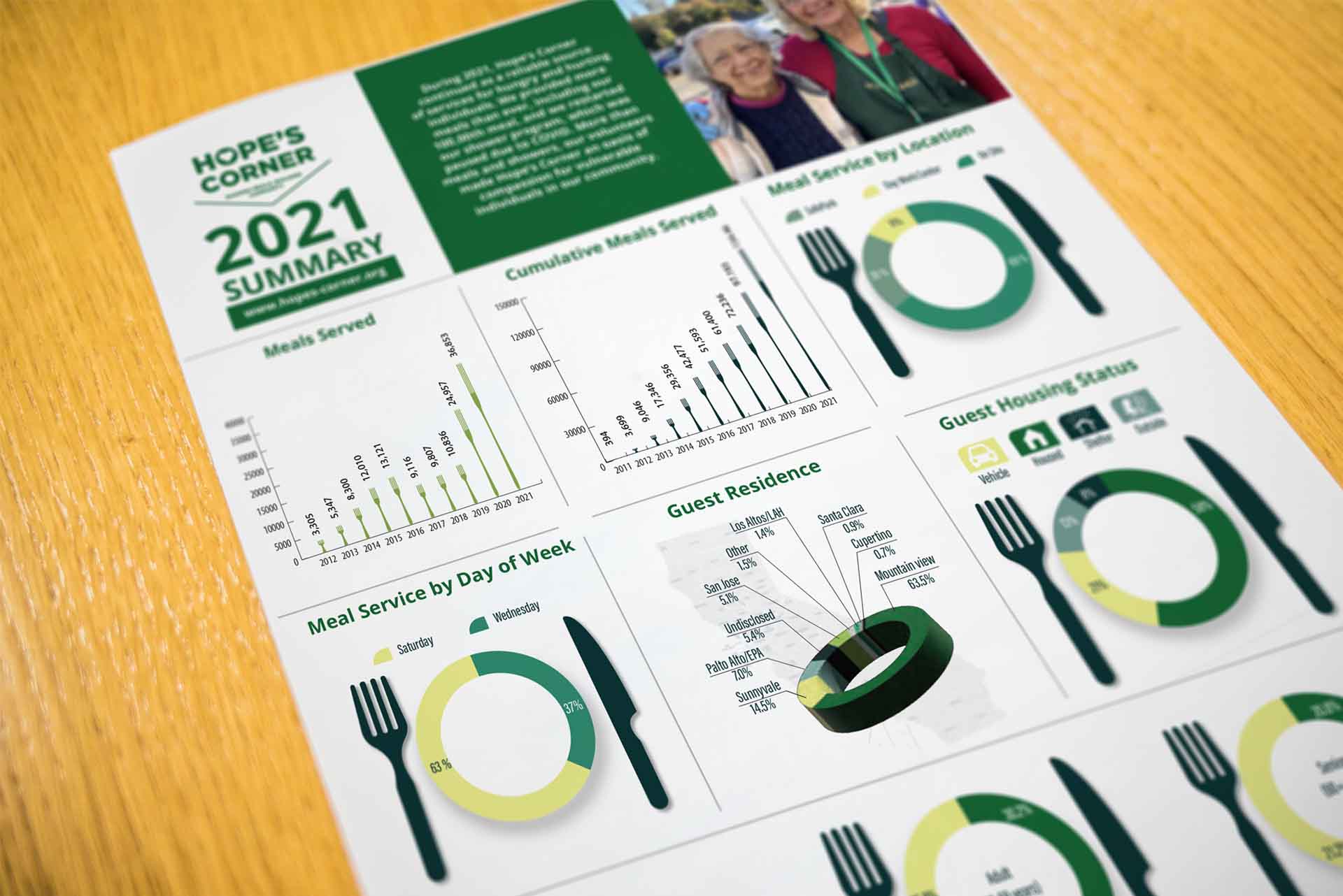
Hope’s Corner is a nonprofit organization dedicated to providing free meals, essential services, and support to individuals in need. In 2022, they required a compelling Impact Report for the year 2021 to showcase their annual achievements, donor contributions, and community impact. The goal was to create an engaging, visually appealing, and easy-to-read report that effectively communicated their impact.
Tool
Illustrator
InDesign
Photoshop
Categories


Results & Impact
-
The visually compelling design helped donors and stakeholders quickly grasp the nonprofit’s achievements.
-
The infographic made complex data more accessible and engaging.
-
The report was well-received by the organization, leading to increased donor engagement and positive feedback.


